

This is Part 3 in our series on customer journey optimization. "Originally from LinkedIn here" If you haven't read Part 1: Rethinking Customer Journeys, start there to understand the full Connect, Understand, Engage, Guide framework.
In This Series:
You've done the hard work of connecting your systems. Website behavior flows to your CRM. Customer data informs your website. All your teams can finally see what people are doing across your digital touchpoints.
So now what?
This is where many organisations hit a wall. They have data, and sometimes lots of it, but they're not sure what it means or what to do with it.
"Sarah visited our pricing page three times this week."
Okay, but... so what? Is she about to buy? Is she comparing you to competitors? Is she confused about something? Should sales reach out now or wait?
This is the gap that the Understand pillar fills.
Understand is about transforming raw behavioral data into signals that drive action. It's the difference between knowing what happened and knowing what it means, and perhaps even more importantly, what to do about it.
Today, we're looking more closely at how to build that capability.
Let's start with a common scenario. Your marketing automation platform shows that a prospect has opened 8 emails in the past month, clicked through to your website 4 times, downloaded 2 whitepapers, visited your pricing page twice, and spent 12 minutes reading a case study.
Your website analytics adds more to the picture. They've had 7 sessions over 3 weeks, with an average session duration of 4 minutes across 23 pages. They searched for "integration with Salesforce" and arrived at your website initially from organic search, then via a LinkedIn ad, and more recently through direct traffic.
Meanwhile, your CRM tells you they filled out a request for information form 18 days ago. Sales attempted contact twice but got no response. They're sitting in the "Attempted Contact" stage. They're a Director of Operations at a company with 500 or more employees.
So… what do you do with all this information?
Most sales reps would struggle to synthesize this into a coherent story, let alone a clear next action. And if you multiply this by hundreds or thousands of prospects or leads, the problem becomes overwhelming.
This is exactly why Understand matters. It's about creating systems and models that translate behavior to inform the best action to take and can be broken down into the following:
Signals: What this behavior indicates about intent, interest, or readiness.
Context: Where this person is in their journey and what they need next.
Priority: Who needs attention right now versus who's still early in their research.
Actions: What your team should do based on what you're seeing.
Marketing, sales, and customer success all need access to this kind of thinking. When everyone in an organisation operates from a shared understanding of customer data, it stops being a reporting exercise and starts becoming a genuine competitive advantage.
Traditional analytics are built around aggregate metrics. Bounce rates, open rates, conversion percentages. These numbers have their place, they help you understand overall performance and spot broad trends. But they have a fundamental limitation: they tell you nothing about what to do with the individual person in front of you right now.
Understand requires a different lens entirely.
Instead of asking what percentage of visitors view your pricing page, you ask what it means when this specific person views it three times in one week. Instead of tracking your average time to first response, you ask when the optimal moment to reach out is given this particular person's behavior pattern. Instead of identifying which content performs best overall, you ask which content sequence tends to lead to conversion for people in this industry and this role.
It sounds like a small shift, but it changes almost everything about how you interpret data and make decisions.
Aggregate metrics will always have a role in understanding your overall funnel health and the performance of campaigns and channels. But the moment you're trying to decide whether to call someone today, what to say when you do, or whether a particular customer is at risk of leaving, averages become almost useless. You're not dealing with a percentage. You're dealing with a person.
Building the capability to understand individuals rather than just populations is one of the most valuable things an organisation can do. It's also, frankly, one of the hardest. But that's what the rest of this article is all about.
Let's break down what you need to build effective understanding using the information you’re now able to capture from the Connect phase in the previous article.
First, let’s talk about the differences between metrics and signals. While a metric tells you what happened. A signal tells you what it means.
Here are some examples of metrics
Here is what a signal looks like for comparison
The difference? Signals are interpreted and contextualized.
So how do you identify meaningful signals? Start by asking what behaviors actually correlate with outcomes you care about. This can include which actions predict conversion, which behaviors indicate someone is stuck or confused, what patterns emerge before someone churns and leaves you, and which engagement types lead to expansion or upsell new products or services.
Let’s imagine we are selling a Software as a service product to other businesses (B2B SaaS). Here are different signals you could use:
Buying Intent: Website pricing page visits, product comparison page views, case study or customer story engagement, online ROI calculator usage, downloading security/compliance documentation, or viewing implementation guides.
Research Phase: "What is" or "How to" website content consumption, industry overview page views, general feature exploration, newsletter sign-up, and social media follows.
Friction Indicators: Customers searching support documentation, FAQ webpage visits, multiple form abandonments, decreased website session frequency after an increase, competitor comparison page views, or unsubscribing from emails.
Expansion/Upsell: For existing customers, feature pages for higher tiers, integration marketplace browsing, usage approaching plan limits, admin portal activity, or inviting many new team members.
Not everyone starts in the same headspace as one another. Someone researching their first product has different needs than someone evaluating their three finalists. We can consider this as different stages in a customer journey.
Customer journeys often start with awareness, which is when someone is learning about a problem or solution category. The content they access will be educational and problem-focused. They will do broad exploration and general searches such as "what is…”. Their individual needs will focus on basic understanding and education. Any they may be put off by over eager sales people putting pressure on them.
After awareness may come consideration when someone is actively evaluating their options. They will be interested in website content that contains comparisons, features, and how those differentiate from others in the market. Some types of behaviour to keep an eye on include multiple website visits, focused exploration and comparison shopping. Before they move on from this stage, they will most likely want clarity on product differences, proof points, and functionality details.
Next comes the decision stage where they are choosing between finalists. Content often consumed here would be related to pricing and implementation. Reviewing customer stories and case studies are useful for them here as well. It is in this period that the customer will be doing deep dives into products and service and may be consulting with multiple stakeholders. This lets them build their confidence and understand any of the risks.
That leads to the purchasing or conversion stage when the customer is ready to commit. They will be looking at getting started guides and onboarding materials (if appropriate).
All of the previously mentioned stages lead up to the purchase. Post-purchase then includes additional stages and phases such as onboarding and adoption, where the focus is on learning the system and growing their usage. Then there is expansion and renewal when the customer evaluates their continual use and their growing needs. Finally, there is advocacy, which includes sharing experiences and (hopefully) referring others. Each of these post-purchase stages have their own indicators which you should monitor.
The challenge through all of this is that people don't follow linear paths. Someone might jump from awareness to decision if they're switching from a competitor. Others might cycle between consideration and awareness multiple times.
We should all be thinking about how to build models that are flexible enough to recognize where someone actually is, not where you think they should be.
The frequency and timing that people engage with you matters as much as what actions are taken. There can be many types or personas of potential customers. Here are some stereotypes to think about:
Meet Barry “the binge researcher”. He has multiple website sessions in short timeframe and deeply explores content. In each website session, he looks at a large number of pages. His signals related to high intent and is gathering information for making a decision.
Next we have Sally “the slow burn”. She has consistently visited the website over many weeks, or even months. There is steady but modest engagement, and she tends to return to the same content many times. Her signals show a need for nurturing and indicate a long evaluation cycle before committing.
Here we have “the ghost” that shows high initial engagement followed by a sudden drop-off. They do not respond to any outreach. This type of activity suggests they’ve lost interest, found an alternative, or have internal blockers.
Finally, we have Ronald the “the returner” who after a long period of inactivity, has suddenly reengaged, often with a different focus. His signals show that circumstances changed. There may be new stakeholders involved or a renewed priority.
These are just some examples, but hopefully you can start to get a feel for different patterns and what they may mean. You can also consider time of day patterns, such as are they most active on your website during the morning, midday, afternoon, or evening. This can help inform the best time to contact them on a schedule that works for them.
Velocity matters too. Increasing velocity when visits become more frequent often indicates rising intent. While a decrease in velocity after high engagement can signal cooling interest or obstacles.
Sudden acceleration after slow burn suggests a trigger event like a budget being approved, a quarter ending, or a having issues with one of your competitors.
Behavior doesn't exist in isolation. Layering in context can help you to understand the full picture. Using the old staples like customer demographics (B2C) or firmographics (B2B) can help. In addition to these traditional data points like age, location, job title, or industry, factor in temporal context such as time of day or week of engagement, fiscal calendar, even when industry events are on can be useful.
The relationship context is also important, including how they found you, how long have they been aware of you, and are they a current customer or not. Past interactions, including support tickets and sales conversations, are great information sources.
Let's now look at how changing the context will also change meaning. "Visited pricing page" means different things for:
Now we’ve covered some of the foundational building blocks. Now let's get tactical. Here are proven approaches to help you build understanding.
Lead scoring is a practice that assigns point values to behaviors and attributes to quantify customer engagement and their fit to your product or services. Scores are calculated based on different categories, including demographic and firmographics that align with how well someone fits your ideal customer profile (ICP), as well as behavior scoring that indicates their level of interest.
For example, someone may earn points if they live in a particular geography or have a particular job title. They may also earn different number of points for visiting certain web pages, opening emails, or visiting the website multiple times in a single day or week.
Points are then subtracted due to activity associated with someone who is not interested, such as unsubscribing from newsletters, residing outside of a target geography, or if they only viewed non-core website content like the careers page and didn’t view the product page. This is also where a time decay value is factored in, reducing scores for when activity is detected at milestones like 30, 60, or 90 days.
The net score after points are earned or lost can then be used to prioritise leads.
Some models may separate a lead score from a lead grade. A lead grade is the fit and alignment of a customer to the ICP, while the score only represents the level of interest and likelihood of becoming a customer. Whether you are tracking the score in a single indicator or across multiple, it is a good way to start understanding differences between customers.
When designing lead scoring systems, beware of treating all interactions equally, as not all behaviors indicate the same level of intent. Don’t forget to regularly calibrate the points that can be earned or lost against actual conversion data. Also, don’t make the model too complex. The power in this model is its simplicity. If your team doesn't understand it, there’s a risk they won't trust it.
While the approach above is a simple rules-based approach, read on for more approaches, including using machine learning predictions.
This next approach groups people based on behavioral patterns, not just demographics, into different cohorts. They allow you to create segment-specific strategies rather than treating everyone the same. For example, a “window shopper” responds differently than a “ready buyer” to the same messaging.
Here are some cohorts that may be relevant for you in your industry:
The Researchers: This segment looks at a lot of website content with a focus on educational material. They may show a long time between visits. Nurture these people with educational content about your product and services, and don't push sales too hard.
The Evaluators: Comparison-focused with multiple product/feature page visits and paying attention to the pricing page. They need to be provided with differentiated content, competitive battle cards, and ROI tools.
The Ready Buyers: These people navigate directly to pricing or demo website pages and enjoy content on implementation or case studies. These are the customers you want to fast-track to sales, remove all friction from them, and provide a clear call to action (CTA).
The Window Shoppers: Window shoppers show only surface-level browsing with no deep engagement. They are often one-time visitors. Generally, these should be treated as low-touch and, if you can, present them with content that focuses on awareness.
The Power Users: These are often existing customers that show frequent logins to online portals, exploration of lots of features and consume your support content often. By grouping these customers together you’ve got a great target for upsells and expansion plays, gaining feedback on products and services, and members for advocacy programs you may run.
There are a number of models that use historical data to predict future behavior, these are called propensity models. Depending on the amount of historic data you have access to and your maturity you may choose to have a simple rules-base approach, such as "If customer hasn't logged in for 30 days AND has open support ticket AND approaching renewal, flag as churn risk". Or you could adopt a regression analysis using logistic regression to weight multiple factors and generate probability scores. Finally, for larger datasets use machine learning algorithms to identify complex patterns.
If it’s your first time, we recommend starting simple. Rules-based models built on your team's intuition often work well enough and are easier to explain and maintain.
Here are three of the common propensity models:
Propensity to Buy/Convert: This focuses on behaviours and characteristics that can predict conversion. Models are trained on a number of factors, including:
These are then applied to current prospects to identify conversion likelihood and prioritize sales outreach. They can trigger automated nurture activities for high-propensity prospects to make sure they are looked after.
Propensity to Churn: Identifies existing customers at high risk of leaving, allowing for proactive retention efforts. This model should look for activity like:
Propensity to Expand: This can be useful to find existing customers who are ready for a higher-tier of product.
Also known as sales attribution, this approach is used to understand which touchpoints actually contribute to a customer buying or converting. This is increasingly becoming more important as leaders with limited budgets, and particularly those who are managing complex customer journeys, need to justify expenditure and demonstrate effectiveness.
Two of the simplest approaches are last-touch and first-touch attribution. Last-touch Attribution credits the final interaction between the organisation and the customer before conversion as the activity that led to the sale. Last-touch is simple but misleading as it ignores the entire customer nurturing journey. First-touch credits the initial discovery interaction with the customer and while useful for understanding the “top-of-funnel”, i.e. where the customer came from, it ignores everything after that.
Multi-touch attribution is our recommendation. This is a model that distributes credit across multiple touchpoints. It is far more accurate and gives a better representation than single-touch attribution, but it is more complex.
Linear: In this attribution model, an equal amount of credit applies to all touchpoints a customer may have, including website visits or talking to a salesperson.
Time-Decay: With time-decay interactions that occur most recently are weighted more heavily than older ones.
Position-Based (U-Shaped): More credit is given to the first and last touches (40% each), while less is given to those in the middle (20%). There is also a W-Shaped model with emphasis on the first touch, lead creation, and then opportunity creation.
Attribution matters for Understand as it tells you which content, channels, and interactions actually move people forward versus vanity metrics that look good but don't drive outcomes. For example, you might discover that while your gated whitepapers get lots of downloads (vanity metric), they rarely lead to conversion. Meanwhile, ungated case studies that get fewer views have much higher conversion rates downstream.
This changes your content strategy and how you interpret engagement.
Not all engagement is equal so build metrics that measure quality, not just quantity. Here are some quick, rapid fire indicators you can consider.
Time on page (contextual): 10 seconds on pricing page = scanning. 3 minutes on pricing page = serious evaluation.
Scroll depth: Scrolled 20% = bounced quickly. Scrolled 80%+ = consumed content.
Return visits to same content: Coming back to the pricing page 3 times = comparison shopping. Single visit = casual interest.
Content sequence matters:
Engagement recency: Active today = hot. Last activity 60 days ago = cold.
Multi-session engagement: Single session = impulse/curiosity. 5+ sessions over time = genuine interest.
Consider building a "quality score" that combines these factors rather than solely counting page views.
Understanding is only valuable if it drives action. Having great signals and sophisticated models means nothing if they don't change what your teams do. Here's how to build the operating model that bridges insight and execution.
One of the most powerful way to operationalize understanding is through simple "when this, then that" logic. Here are some examples we’ve seen different organisations adopt depending on signals and context.
When a prospect hits a high-intent threshold, the system automatically assigns them to the right sales rep, sends a personalized introductory email on that rep's behalf, and fires off a Slack notification with the behavioral context that triggered the alert.
When a churn risk is detected, the customer success manager is alerted, a re-engagement campaign kicks off, and a health check call is scheduled before the customer ever thinks about leaving.
When an expansion opportunity surfaces, the account manager is flagged in time to prepare for a meaningful conversation rather than a generic check-in.
The goal isn't complexity. It's making sure that every important signal automatically connects to a logical next action so nothing falls through the cracks.
One of the fastest ways to erode trust in your understanding framework is to overwhelm your teams with noise. If every minor behavioral signal generates a notification, people will start ignoring all of them, including the important ones. Alert fatigue is real, and it's a serious operational risk.
Instead, design your alerts around the signals that genuinely change what someone should do next.
Sales teams care when a high-score lead requests a demo, when a previously cold contact suddenly re-engages, or when an enterprise prospect visits a competitor comparison page.
Marketing teams want to know when a campaign is driving unusually high-intent traffic worth doubling down on, or when content is generating engagement but failing to convert.
Customer success teams need early warning when usage starts declining or when support ticket patterns suggest a relationship at risk.
Set your thresholds carefully and review them regularly. The right alert at the right time is incredibly valuable. The wrong alert at the wrong time is just noise.
Alert fatigue is real. Set thresholds that filter for truly meaningful signals.
Don't overwhelm teams with every signal. Focus on the ones that matter most.
Insights are only useful if they're accessible in the tools your teams already use every day. In your CRM, contact and account records should surface a behavioral timeline, a prominently displayed intent score, a journey stage indicator, and a clear recommended next action. Burying this information in a separate analytics platform means it won't get used.
Customer success platforms should incorporate website behavior into health scores, surface early warning indicators before they become urgent, and flag expansion opportunities before the renewal conversation. Sales tools should help reps answer the question "who should I contact today and why?" with enough behavioral context to make the conversation feel informed and relevant rather than generic.
The principle is simple, understanding should come to your teams, not the other way around.
The best operating models are not fully automated, nor are they fully manual. They use automation to handle the things machines do well, and they preserve human judgment for the things people do better.
Automation should handle data collection and aggregation, signal detection and scoring, routing and assignment, routine follow-ups, and reporting. These tasks are high volume, time sensitive, and benefit from consistency. Humans should handle complex interpretation, strategic decisions, high-value conversations, relationship building, and anything that falls outside expected patterns.
Here’s a practical example of how this plays out. The system detects high-intent signals and scores a lead as ready for outreach. It routes the lead to the right rep based on territory or specialization and sends the rep a notification with the full behavioral context. The rep then reviews that context and decides how to approach the conversation, personalizing the outreach based on what they see. The system logs the activity, keeps monitoring, and if there's no response, triggers a follow-up sequence. The rep then makes the judgment call on whether to persist or step back.
Neither the human nor the automation could do this as well alone. Together, they cover each other's weaknesses.
This is fast becoming one of my favourite sections in this series. Let’s look at traps or anti-patterns that you should try to avoid when it comes to Understand.
Pitfall 1 - Analysis Paralysis: Trying to understand everything perfectly before taking action.
Solution: Start with simple models, test them, and refine based on what works. Done is better than perfect.
Pitfall 2 - Ignoring the "Why": Seeing patterns but not investigating root causes. For example, lots of people abandon your demo request form.
❌ Response: "We need more leads in top of funnel"
✅ Response: "Why are they abandoning? Is the form too long? Asking for too much? Not clear what happens next?"
Solution: Combine quantitative signals with qualitative research (surveys, interviews, session recordings).
Pitfall 3 - Static Models: Building scoring or attribution models once and never updating them.
Solution: Review quarterly. Markets change. Buyer behavior evolves. What indicated intent last year might not this year.
Pitfall 4 - Confusing Correlation and Causation: "Everyone who converts viewed our case studies, so case studies drive conversion."
Maybe. Or maybe people who are already ready to buy seek out case studies for final validation.
Solution: Test hypotheses. Run experiments. Be skeptical of your assumptions.
Pitfall 5 - Data Without Context: Treating all pricing page visits the same regardless of who's visiting.
Solution: Always layer context. Behavior + firmographic + temporal + relationship data = understanding.
Pitfall 6 - Ignoring Negative Signals: Only looking at what people do, not what they stop doing.
Solution: Track disengagement, unsubscribes, decreased activity. These signals matter too.
Pitfall 7 - Over-Automation: Removing human judgment entirely from the process.
Solution: Automation should enhance human decision-making, not replace it. Keep humans in the loop for complex or high-value situations.
Here's some actionable steps for how to move forward
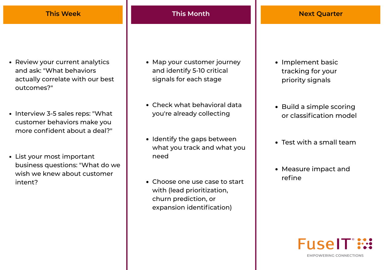
Remember: Understanding is built iteratively. You don't need perfect data or sophisticated models to start. You need:
Start simple. Prove value. Build from there.
Understanding transforms data from a reporting exercise into a decision-making asset.
When you understand your customers' behavior patterns, you can:
But understanding isn't a destination, rather it's a capability you build and refine continuously.
Markets change. Customers evolve. New competitors emerge. What indicated buying intent last year might not this year. Your understanding framework needs to be living, breathing, and constantly learning.
The organisations that win aren't the ones with the most data. They're the ones who best understand what that data means and what to do about it.
Finally, let’s not forget that this applies to all your teams in an organisation. It doesn’t matter if you’re in the marketing team, or the sales team, or the customer success team you all need to understand your customer data.
Coming Next: In Part 4, we'll dive deep into Engage: how to use these insights to create personalized experiences that feel helpful rather than creepy, balance automation with authenticity, and measure what actually drives results.
Questions? Connect with us on LinkedIn or schedule a conversation to discuss your specific understanding challenges.
Has this triggered any questions, and want to keep the conversation flowing? We'd love to talk.

Connecting systems and people since 1992.
A New Zealand–founded global tech company.


By clicking 'Accept all', you agree to the storing of cookies on your device to enhance site navigation, analyze site usage, and assist in our marketing efforts. View our Privacy Policy for more information.