

The short answer. To increase prospective student engagement on a university website, stop sending everyone the same content. Identify who each visitor is, notice which pages they keep returning to, and respond with guidance matched to that behaviour. Students engage when a website feels like it knows them, and switch off when it treats them as one of a crowd.
Consider a student who starts looking at undergraduate options eighteen months before she will enrol. She visits on her phone, compares three programmes, reads about scholarships, and bookmarks the entry requirements page. A week later a parent opens the same site on a laptop, looking for fees and accommodation costs. Most institutions see none of this as connected. They send both the same prospectus email, then wonder why engagement is flat.
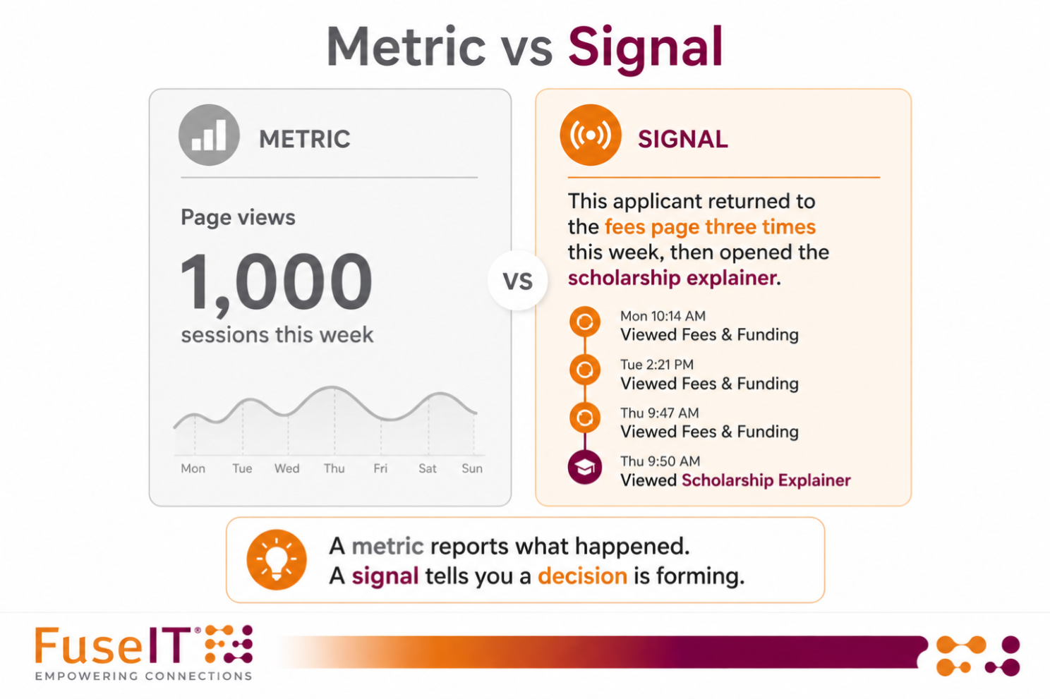
Student engagement on a website is the pattern of actions that signal genuine intent: returning to the same programme page, checking whether you would qualify, coming back a week later to read it again. Not every action carries the same weight. A single page view is a metric. The same student opening the fees page three times in a week is a signal. The engagement worth increasing is the second kind, because it tells you where a real decision is forming.
They disengage because the content does not match the decision they are making. An engineering applicant and a geography applicant get the same email, so neither finds anything in it that speaks to the choice in front of them. A student comparing scholarships gets an open-day reminder, when her real question is whether she can afford to come at all. Each message tells her the institution has not registered what she is trying to work out. The problem is not a shortage of data; it is a shortage of connected data. Signals sit in separate tools, and by the time someone assembles the full picture, the moment to respond well has passed. Prospective students describe this as feeling processed rather than known, and it is the most common reason they quietly go elsewhere.
Three moves, in order:
Design all of it for a phone first. Most prospective student enquiries now arrive on mobile, so any experience that only works on a desktop is, for most students, untold.
The student is rarely the only decision-maker. Parents and school advisors are frequently co-deciding, especially for undergraduate and international study. When the parent researching fees on a laptop and the student comparing programmes on a phone are recognised as part of one journey, you can open a shared space that answers both sets of questions in one place: what the course involves, what it costs, and what funding exists. The student feels known, the parent feels informed, and the institution looks coherent instead of scattered.
How is student engagement different from website traffic? Traffic counts visits; engagement reveals intent. A thousand sessions tell you the site was busy. One applicant returning to the fees and scholarship pages across a week tells you a decision is forming and where to help. Chase the second, not the first.
Can you personalise a university website without replacing the systems you already run? Largely, yes. The two things that do the work, a CRM holding the student record and the website where the behaviour happens, are things most institutions already own. What is usually missing is the layer that makes them read and respond to each other in real time. That layer is an addition, not a rebuild: there is a product to license, but no separate platform for your team to log into and no system of record to rip out. You are making the stack you already pay for intelligent, rather than buying a parallel one.
What is a good engagement rate for a university website? There is no single benchmark worth chasing, because a high rate on generic content still converts poorly. A more useful measure is how quickly the institution recognises a high-intent student and responds with something relevant. A practical target is to respond within an hour of a strong signal, while the student is still weighing the decision, rather than in the next scheduled campaign send. Speed to a relevant response beats any aggregate rate.
This is not about adding systems. It is about making the website and CRM an institution already pays for recognise the student and respond in the moment. That is the idea behind LoupeEd, and the wider pressure that makes it urgent is the subject of our session on higher education under pressure.
Part 2 coming soon, how to keep current students engaged and spot the ones slipping away, and Part 3, how to keep alumni engaged after graduation.
This article was originally posted on our linkedIn here
Has this triggered any questions, and want to keep the conversation flowing? We'd love to talk.




Connecting systems and people since 1992.
A New Zealand–founded global tech company.


By clicking 'Accept all', you agree to the storing of cookies on your device to enhance site navigation, analyze site usage, and assist in our marketing efforts. View our Privacy Policy for more information.
